The NIVEA Blue Effect: Can Increased Distinctiveness Create Likelihood of Confusion Based on Common Colours?


- Higher Board of the Turkish Patent and Trademark Office upheld Beiersdorf’s opposition against a later trademark sharing NIVEA's distinctive blue-and-white composition
- The Board highlighted the later mark could cause a likelihood of confusion with NIVEA, give the earlier’s strong distinctiveness and recognisability from its blue and white colour scheme
- This precedent confirms colour and composition similarities can be decisive in trademark disputes when earlier marks have gained distinctiveness through consistent use of certain colours
Comparisons between word and figurative trademarks are made based on well-established principles. However, if the similarity argument is based primarily on common colours and composition, the evaluation is more complex, and a more holistic approach prevails.
Background
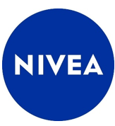
The Re-Examination and Evaluation Board (the Higher Board) of the Turkish Patent and Trademark Office rendered a decision based on the opposition filed by Beiersdorf AG, relying on its well-known NIVEA trademarks in a blue-white circular form:
Beiersdorf claimed that the contested trademark below creates a likelihood of confusion with its earlier NIVEA trademarks:

Beiersdorf submitted substantive evidence demonstrating that the NIVEA trademark has become strongly identified with the blue and white colour combination in the cosmetics industry. It also argued the well-known status of NIVEA trademarks as a separate ground and factor affecting likelihood of confusion.
Decision
In its decision of 2 December 2025, the Higher Board highlighted that both signs share similar compositions and blue and white colour elements. It also noted the use of the word ‘blue’ in the contested trademark, as well as the use of the colour blue in the background of the contested trademark and its similarity with the colour for which NIVEA trademarks have gained increased distinctiveness in cosmetics industry. The Higher Board, therefore, considered the use of the word ‘blue’ and the colour elements in the application as a fact reinforcing similarity between the trademarks.
Based on this assessment, the Higher Board concluded that there is likelihood of confusion between the trademarks and likelihood of association because of the well-known status of NIVEA trademarks for perfumes, cosmetics, fragranced goods, soaps and other similar goods in class 3, and for services in class 35 related to distributing those goods.
Comment
Although the Higher Board’s decision may be challenged through a cancellation action filed before the Ankara Civil IP courts, this case sets an important precedent in Turkish trademark practice.
NIVEA is a globally well-known trademark in the cosmetic industry, and its circular blue and white composition have become instantly identifiable with the brand. The Higher Board took this recognisability into account during its assessment, which Beiersdorf supported with the provision of substantial evidence and precedents. In the present case, the recognisable colour elements of NIVEA products and its well-established reputation significantly increased the risk that consumers would perceive a link between the trademarks and their sources.
This decision supports the idea that even when the word elements differ, common colours and similarity of composition may give rise to a likelihood of confusion, particularly where those colours are considered a key element of the trademarks, and earlier marks enjoy increased distinctiveness arising from those elements. The Higher Board’s reasoning further indicates that even a verbal reference to a colour – such as the inclusion of the word ‘blue’ in the present case – may strengthen the association where the specific colour forms the core of the earlier mark’s increased distinctiveness. This approach reflects a nuanced understanding of how consumers perceive trademarks in practice, where visual memory and colour recognition outweigh verbal differentiation.
From a broader perspective, the decision is significant in showing that where a trademark has gained increased distinctiveness through consistent and extensive use of certain colours, those colours may play a decisive role in the authority’s analysis of likelihood of confusion. It further highlights the importance of holistic evaluation in opposition proceedings and its consideration of all elements of the trademarks.
First published by WTR in Jan 26, 2026.